In today’s digital age, websites that load quickly and provide a seamless user experience are crucial for retaining visitors and ranking well in search engines. One of the key factors that affect both user experience and SEO rankings is Core Web Vitals.
What Are Core Web Vitals?
Core Web Vitals are a set of three specific web page experience metrics that Google considers essential for user satisfaction. They include Largest Contentful Paint (LCP), First Input Delay (FID), and Cumulative Layout Shift (CLS). These metrics focus on load performance, interactivity, and visual stability, respectively.
Why Do Core Web Vitals Matter?
Core Web Vitals matter because they directly impact the user experience. Google has made it clear that these metrics play a significant role in search engine rankings. Sites with poor Core Web Vitals are more likely to see decreased organic traffic and conversions.
How to Measure Core Web Vitals?
Tools for Measurement
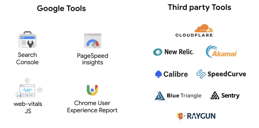
Before you can improve Core Web Vitals, you need to measure them accurately. Google provides several tools, including Google PageSpeed Insights, Lighthouse, and Chrome DevTools, to help you assess your website’s performance.
Real-World Examples
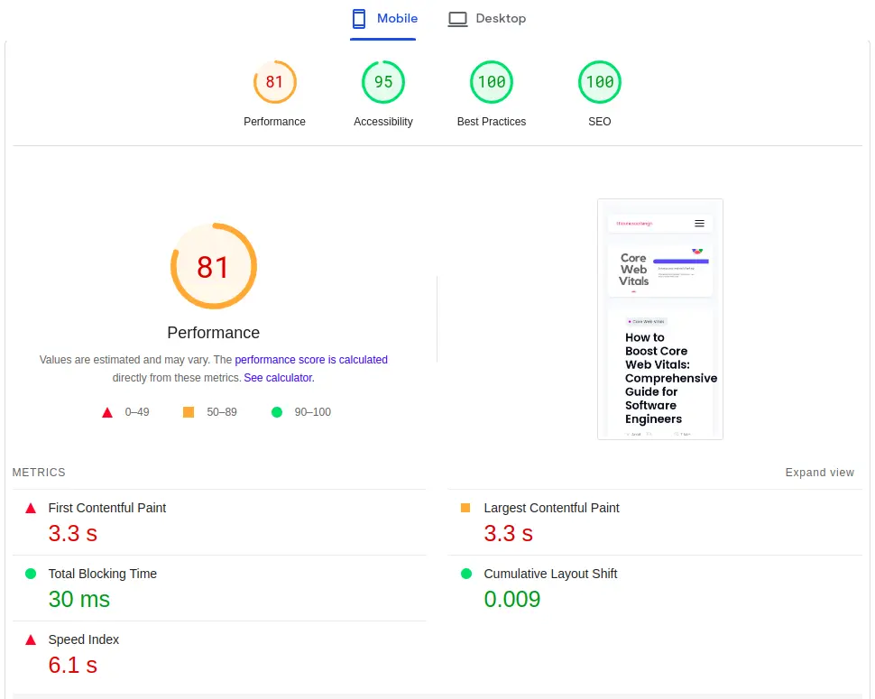
To truly grasp the significance of Core Web Vitals, let’s delve into real-world examples of websites with varying Core Web Vitals scores. By examining these cases, you’ll gain a practical understanding of how these metrics impact the user experience and overall website performance.
Google Web Core Vitals Key Metrics Breakdown

Largest Contentful Paint (LCP)
LCP measures how quickly the largest content element in the viewport is painted. We’ll delve into strategies to optimize LCP and ensure fast loading times.
First Input Delay (FID)
FID focuses on interactivity by measuring the delay between a user’s interaction (e.g., clicking a button) and the browser’s response. Discover the causes of FID and how to reduce it.
Cumulative Layout Shift (CLS)
CLS addresses visual stability and user frustration caused by unexpected layout shifts. Learn how to prevent layout shifts and improve visual stability.
How to Boost for Core Web Vitals?
Let’s check the ways to improve and boost web core vitals of your website.
Image Optimization
- Reduce image file sizes: Use tools like ImageMagick or online services like TinyPNG to compress images without sacrificing quality.
- Choose the right format: Use WebP for modern browsers, which provides better compression than formats like JPEG or PNG.
- Implement responsive images: Use the srcset attribute to serve different image sizes based on device resolution and screen size.
Video Optimization
- Choose efficient video formats: Use formats like MP4 with H.264 codec for broad compatibility and good compression.
- Compress videos: Utilize video compression tools to reduce file sizes while maintaining acceptable quality.
- Implement lazy loading for videos: Delay video loading until it’s in the user’s viewport to minimize initial load times.
Efficient JavaScript Loading
- Code splitting: Split your JavaScript code into smaller, logical chunks. Load only the necessary code for the current page, reducing initial load times.
- Minification: Minify your JavaScript files by removing whitespace, comments, and unnecessary characters. Tools like UglifyJS can help with this.
- Async and defer attributes: Use the async and defer attributes when including JavaScript files in your HTML. These attributes control when and how scripts are executed, which can improve page loading.
- Lazy loading for scripts: Similar to images, you can defer loading non-essential scripts until they are needed, further improving initial load times.
Content Delivery Networks (CDNs)
- CDN Integration: Use a Content Delivery Network (CDN) to distribute your website’s assets (e.g., images, scripts, stylesheets) across multiple servers worldwide. CDNs reduce server load and serve content from the nearest edge server to the user, improving load times.
- Caching: Configure CDN caching settings to store static assets for longer periods. This reduces the need to fetch assets from your origin server, decreasing latency.
- Image Optimization: Some CDNs offer image optimization services that automatically serve optimized images based on the user’s device and screen size.
Minimizing Render-Blocking Resources
- Async and Defer: Use the
asyncanddeferattributes for your<script>tags to control how JavaScript resources are loaded. This allows other critical resources to load without waiting for JavaScript execution. - Critical CSS: Identify and inline critical CSS in your HTML to render the above-the-fold content quickly. Non-critical CSS can be loaded asynchronously.
- Preconnect and Prefetch: Use the
<link rel="preconnect">and<link rel="prefetch">tags to establish connections and fetch resources before they are actually needed, reducing delays.
Browser Caching
- HTTP Caching Headers: Set appropriate HTTP caching headers (e.g., Cache-Control, Expires, ETag) for your static assets. These headers instruct browsers to cache resources locally, reducing server requests.
- Versioning Assets: Append version or timestamp information to asset URLs when they change. This ensures that browsers fetch the latest version when necessary but still benefit from cached versions when possible.
- Gzip Compression: Enable Gzip or Brotli compression for text-based assets (HTML, CSS, JavaScript). Compressed assets reduce file sizes and load faster.
Ways to improve Mobile Responsiveness
In an increasingly mobile-driven digital landscape, ensuring that your website is optimized for mobile devices is no longer just a good practice; it’s a necessity. Mobile optimization is a pivotal aspect of improving Core Web Vitals for several compelling reasons:
- Mobile-First Indexing: Search engines like Google have shifted to mobile-first indexing, meaning they primarily use the mobile version of a website’s content for ranking and indexing. This makes mobile optimization directly tied to your SEO performance.
- User Behavior: A significant portion of internet users accesses websites from smartphones and tablets. If your website doesn’t perform well on mobile devices, you risk frustrating and losing a substantial portion of your audience.
- Core Web Vitals on Mobile: Core Web Vitals metrics are equally applicable to mobile users. Ensuring a fast and seamless experience on mobile devices directly impacts your LCP, FID, and CLS scores.
Responsive Design
One fundamental aspect of mobile optimization is responsive design. Responsive design is an approach to web design that aims to make web pages render well on a variety of devices and window or screen sizes. Here’s how it works:
- Fluid Grids: Responsive design uses fluid grids that adapt to the screen size. Elements on the page are sized proportionally, ensuring they fit and look good on small mobile screens and larger desktop monitors.
- Flexible Images: Images within responsive designs are also flexible. They automatically scale to fit the screen without distortion or excessive cropping.
- Media Queries: CSS media queries are used to apply different styles and layouts based on the device’s characteristics, such as screen width or device type. This allows for a tailored user experience on various devices.
Mobile-Specific Performance Considerations
In addition to responsive design, there are mobile-specific performance considerations to keep in mind:
- Touchscreen Navigation: Mobile users interact with touchscreens, so ensure that your website’s buttons, links, and navigation elements are touch-friendly and have ample spacing to prevent accidental taps.
- Reduced Bandwidth: Mobile users may have slower internet connections or limited data plans. Optimize your website to load quickly even on slower networks by minimizing data-heavy assets and using efficient coding practices.
- Local Optimization: Mobile users often look for location-specific information. Implement features like location-based services and responsive maps to enhance the user experience for those seeking local information.
- Test on Real Devices: While testing your website’s mobile responsiveness, use real devices to ensure that it functions correctly across a range of smartphones and tablets.
Case Studies
Numerous well-known international companies have seen positive outcomes from their investments in improving Core Web Vitals.

- Tencent Video achieved a 70% improvement in video click-through rates (CTR) after successfully meeting Core Web Vitals requirements.
- Wix experienced a year-on-year increase of more than 250% in mobile origins after successfully meeting Core Web Vitals criteria.
- Nykaa discovered that enhancing LCP by 40% resulted in a 28% increase in organic traffic from Tier 2 and Tier 3 cities.
- Flipkart successfully reduced its bounce rate by 2.6% through enhancements in Core Web Vitals metrics.
- Prioritize a user-centric mindset in your optimization efforts, backed by accurate measurement using tools like Google PageSpeed Insights.
- Understand the three Core Web Vitals metrics – LCP, FID, and CLS – and tailor your optimization strategies accordingly.
- Lastly, remember that optimization is an ongoing process. Regularly assess your website’s performance, adapt to changing technologies, and keep up with Google’s guidelines to maintain and improve your Core Web Vitals over time.
- By implementing these strategies, you’ll not only enhance user experiences but also secure a strong online presence and better search engine rankings. Your journey towards web performance excellence begins now. Good luck!
